AA New Paint

spoolinup22

Well-Known Member
Screen Shot 2013-01-17 at 9.47.25 AM.png


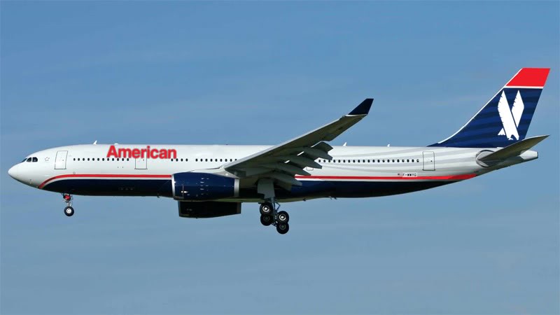
Seems a bit European, but I like it!
 
I miss the eagle and the waterline stripe. Wonder if its merely a neutral livery when the merger is finalized?
 
Is getting a new paint job a rite of passage for airlines exiting bankruptcy? I always though it was hypocritical, you don't have the money to pay your creditors but you have the money to change your paint scheme. Also it seems that is the only time the scheme changes.
 
Is getting a new paint job a rite of passage for airlines exiting bankruptcy? I always though it was hypocritical, you don't have the money to pay your creditors but you have the money to change your paint scheme. Also it seems that is the only time the scheme changes.

Sure. Look for a uniform change next.
 
IMO, the logo looks great, the tail...not so much. In fact, I'd say downright ugly. There are a lot of much cooler designs they could have gone with.

0117aalogotwomo.jpg

0117aalogoplaneonemo.jpg

file.php
 
I'm digging the logo, could have gone a bit more Eagle on it though. The tail is a bit loud, but I like the statement they're making. Only things I'd add is a cheatline and the new logo on the winglets.

/a.net nerd'ism
 
I think the eagle is still there, just changed somewhat. The silver fold over the red and blue near the door looks like the head. My thought is that if it isn't broken, don't fix it. The logo went from classy to cheesy. I think the statement from the pilot union pretty much sums it up:

“A new paint job is fine but it does not fix American’s network deficiencies and toxic culture, so we continue our steadfast support of a merger with US Airways and not doubling down on the network strategy that brought us into bankruptcy.

“American’s network needs more than cosmetic changes to compete with Delta and United, simply put, it needs to merge with US Airways now.”
 
Back
Top