United Livery?

bike21

9-5 Ruins Lives
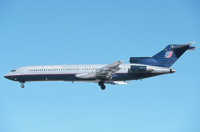
Ok, so I gotta admit - I have been having an a.net type freak out ever since the UAL+CAL merger came out. Are they serious about the new livery and branding? I hope not.

Hopefully there will be some re-branding efforts as the new proposed identity is beyond terrible. The current UAL branding is spot on if you ask me from an aesthetic point. Maybe re-work the CAL globe and keep most of the UAL branding?

Perhaps it is my photo/web/design background, but man this is terrible. Thoughts?

image6457093.jpg
 
When you say, "It looks like crap," do you mean, "Continental looks likes crap," because that's a CAL airplane with a different name on the side.

That's all.

Nothing more.
 
I never liked that globe thing on the tail and yes I agree the current UAL paintjobs look nice and elegant (does it make me sound gay for using the word elegant?). Anyway the current mock up looks stupid and hopefully they aren't serious.
 
For my part, the CAL livery is lacking to begin with. No disrespect to our CAL friends here, but it needs some updating for sure. UAL's old livery (gray planes with previous logo) was crap too. The current UAL branding effort is much more modern + clean.

I think they need to up the ante again. Branding is important like it or not.

Oh don't get me wrong, I hate CAL's paint scheme. I also hate UAL's current paint scheme.

I like this era of United, and I wish they would bring it back:

ua2_b727.jpg
 
It looks fine IMO. Their current livery is better but the CO colors are minimalist and kind of bland, but not off-putting either. Which is preferable to some of the SWA planes.
 
I've said it before and I'll say it again, the capital lower case u has to go. Thats what makes it HIDEOUS. Other than that, meh.
 
I'm cool being the odd man out...I like the Continental paint scheme. If they put United in a different font it'd be just fine.
 
I'm cool being the odd man out...I like the Continental paint scheme. If they put United in a different font it'd be just fine.
Just thought I'd help make you the "even" man out. The Globe on the tail is a classic icon and is associated with CAL and their higher than average customer service and business programs.

"Iconically" speaking... the globe is better than just a funky fonted, bi-colored "U". In addition, there is a "classic" factor behind a simpler paint scheme ie. AA. (Exception being SWA. ;))

That being said... since this is a merger of "equals" per the press releases, the CEO's have both said that they pretty much went down the list of compromises. ie:

Tilton: The new company name will be United.
Smisek: Fine, but we keep the Globe and CAL marketing.
Tilton: Sure, but the HQ is gonna have to be in Chicago.
Smisek: That's alright by me... but I get to be CEO.
Continue ad-nauseum. ;)

While there's opinions that run the gambit from both sides... I'm thinking that the UAL mainline and regional feed employees as well as the west coast public are not exactly happy with the globe... whereas the CAL mainline and regional feed employees and the east coast public are pretty happy with it.

That said... it could just be a "cost" factor. Half the fleet doesn't need new paint with the exception of new lettering, and many of the old faded, peeling, blue/grey UAL planes will finally get their much needed paint job.

My opinion only... YMMV. :pirate:
 
I'm thinking that the UAL mainline and regional feed employees as well as the west coast public are not exactly happy with the globe... whereas the CAL mainline and regional feed employees and the east coast public are pretty happy with it.

That is a potential factor for sure. I will admit at least some bias toward UAL on this. Personally the globe is fine, although I think a new updated version of it would be nicer.

Cost is probably a huge factor as well. Hopefully they will end up doing at least SOME changes to the branding effort.
 
I'm cool being the odd man out...I like the Continental paint scheme. If they put United in a different font it'd be just fine.

Agree. It looks fine.

I even liked the old Continental livery with the red/gold livery and gold tail
 
Back
Top